
Quinzhee
Client: Meghan Strickfaden, Quinzhee Creator
Objective
A quinzhee is Canadian snow shelter made from a large pile of loose snow and was the inspiration behind the creators of Quinzhee; an outdoor, winter protective outerwear garment specifically designed for the seated client. Our task was to create a Brand Identity for Quinzhee that would best represent its functionality, adaptability and its users.
Design Question
How might we design a Brand Identity for Quinzhee to be able to represent the users in an adaptable, approachable and empowering way?

Quinzhee Logo
Concept
The Quinzhee garment is highly engineered and adaptable, much like the Arctic Hare and quinzhee, which is the inspiration behind the logo. The logo is a rendition of an Arctic Hare in motion symbolizing the adaptability and added mobility afforded by the garment and the quinzhee is represented in negative space to convey the garment's engineered structure. The brand identity is applied across various garments and hang tags and other promotional materials.

Garment Schematic Illustrations
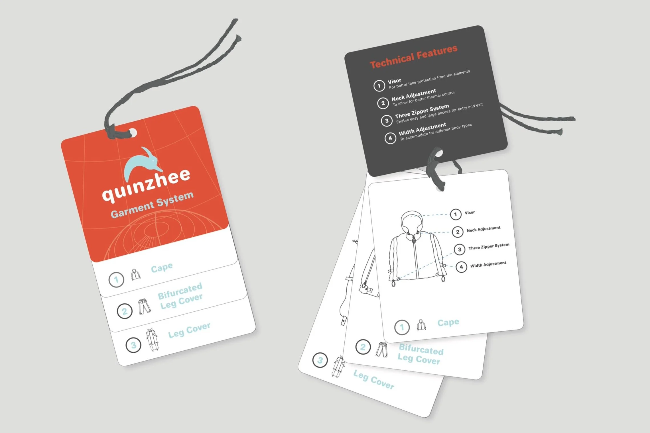
Garment Tags

Brand Identity

Visual Identity Guideline; Spread

Visual Identity Guideline; Front Cover