
size? Home Page Redesign
UI/UX
Home Page Redesign
Client: size?
Role: UI/UX Designer
Background:
Founded in the UK, size? is an Omni-Channel boutique that specializes in footwear. size? is expanding globally and more recently has established itself in the Canadian market, motivated and supported by an unwavering community of culture and streetwear.
Deliverables:
Web and mobile wireframes and mockups
Goals:
Increase usability
Improve user experience
Improve customer retention rate and impressions
Reduce bounce rate
Improve returning customer rate
Design Question:
As a user, what improvements can be made to the Home Page so that I am able to easily navigate the website without frustration, find what I’m looking for, and find alternatives?
As a stakeholder, what improvements can be made to the Home Page in order to improve customer retention, decrease bounce rate, improve product discoverability and increase revenue?
Current Site:

User Testing Pain Points:
Buttons are displayed left, right, and center aligned and users are left frustrated having to navigate the page expecting buttons to be in a consistent position.
Large image sections make it difficult to navigate and find what users are looking for. Testing feedback was the page felt like it was going on forever.
Not enough products shown on the home page to know more specifically what size? sells aside from brands.
Lacks text and descriptions to give context to what users are being directed to.

Research:
Competitor research shows most successful websites that displayed products on the home page helped increase discoverability and provide more information about what the site offers. Home pages were also designed like an editorial in order bridge the gap between product display and providing information about the website in order to improve customer trust and retention.
Concept:
A redesign that more efficiently displayed images and information, more description to add context, and product recommendations would help reduce user pain points.


Redesign with added functionality
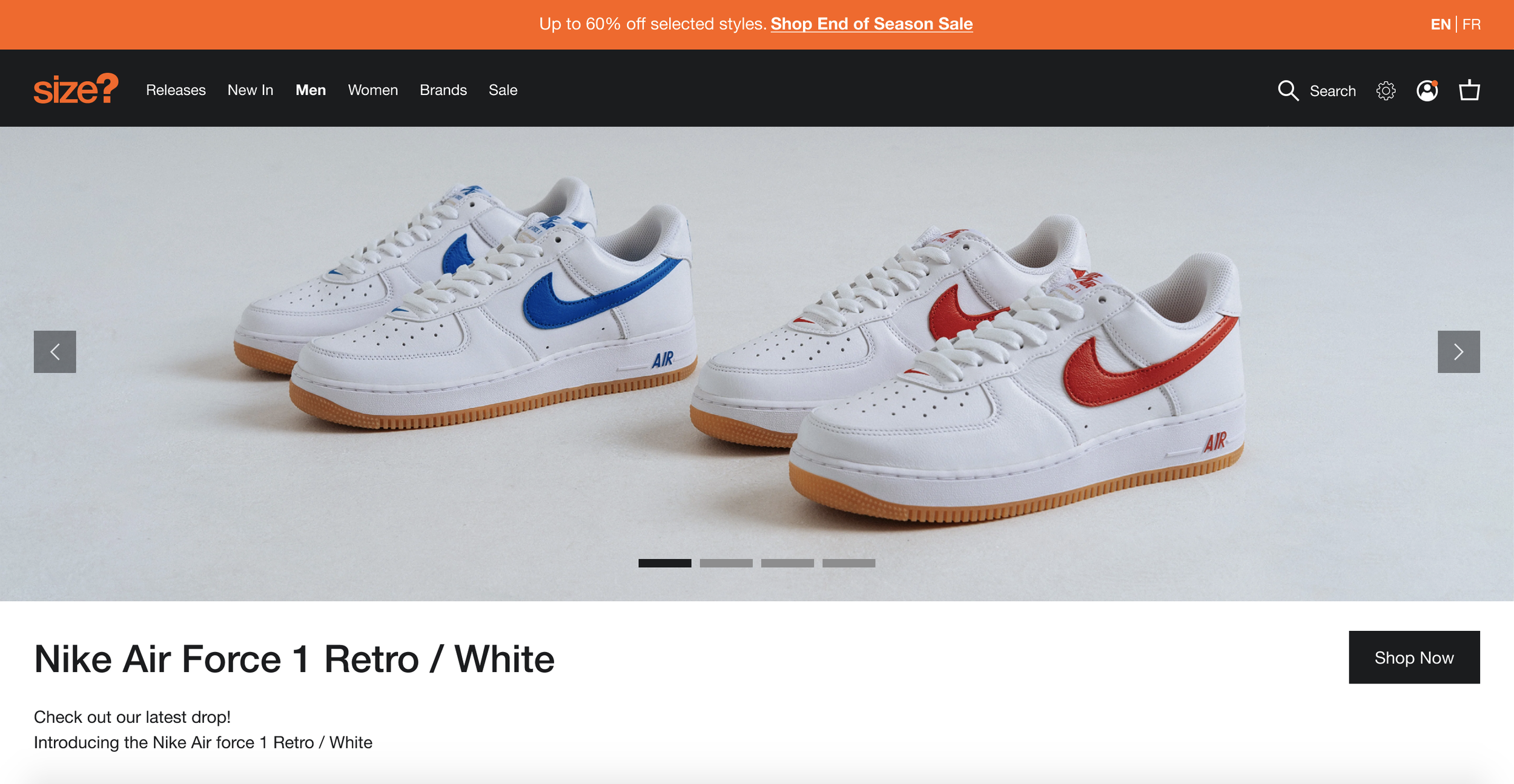
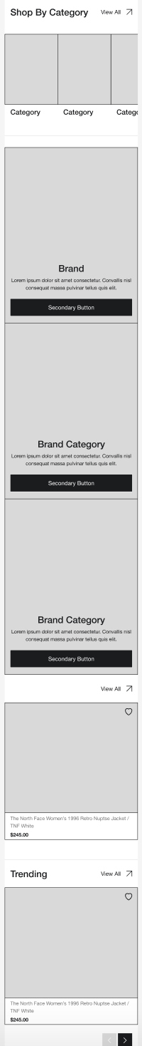
Hero Image; removed text from image area and added context with description

2-up Men’s and Women’s Sections; added links within description to increase discoverability

Product Recommendation zone
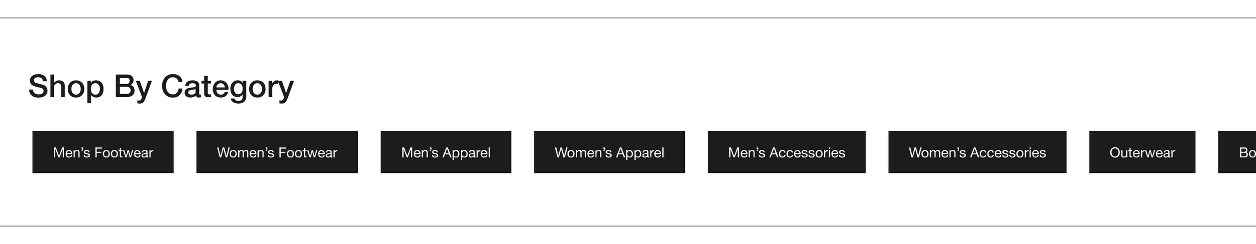
Category Quick Links
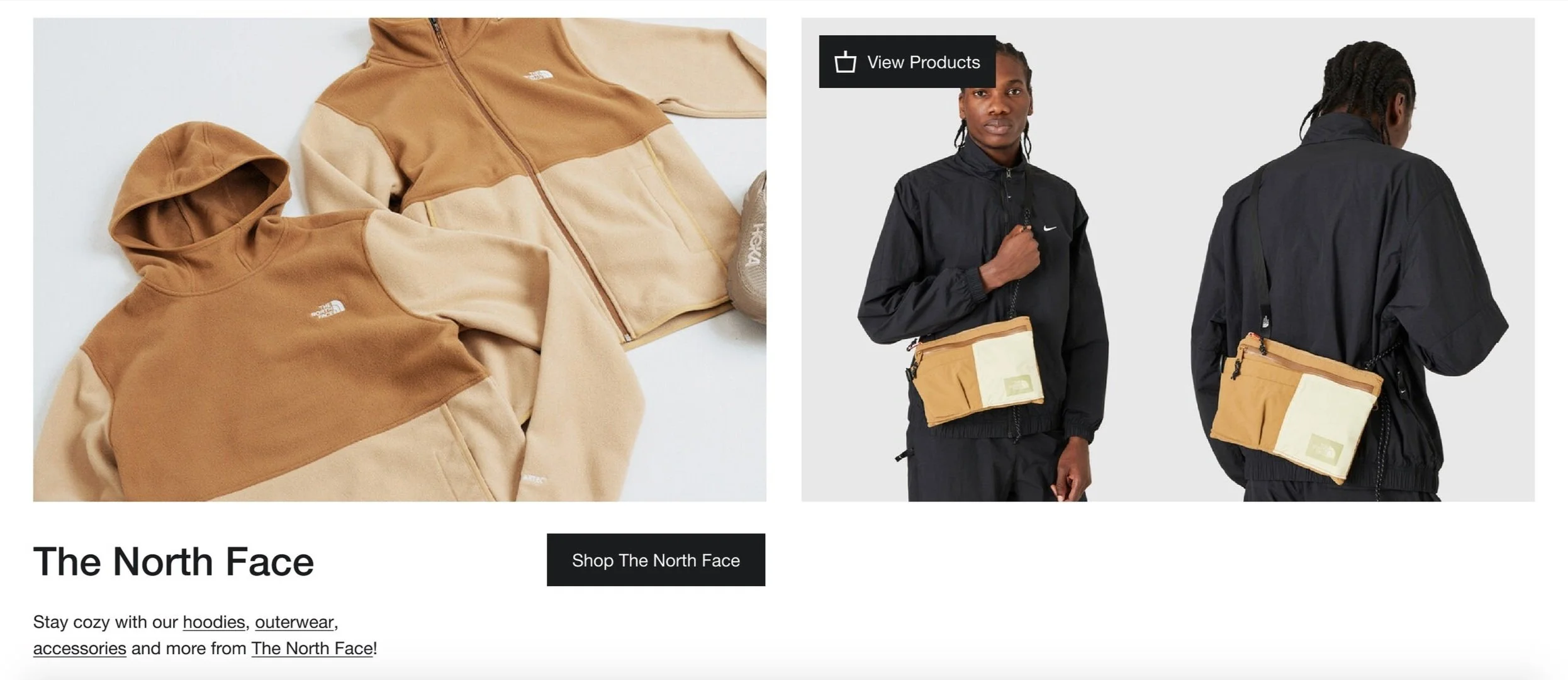
2-up brand specific section w/ brand specific images; functionality to view products displayed in image

2-up brand specific section w/ two different brands
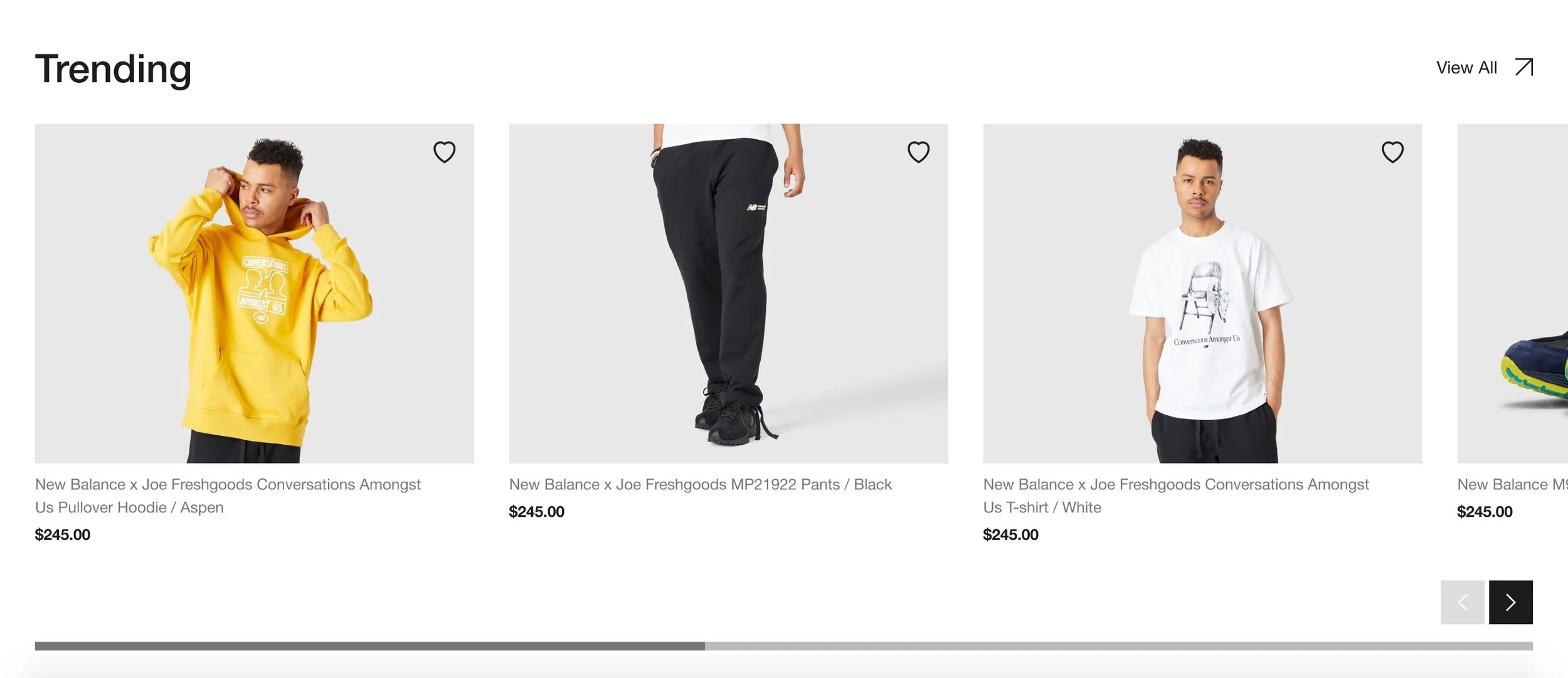
Product Recommendation Zones after each 2-up
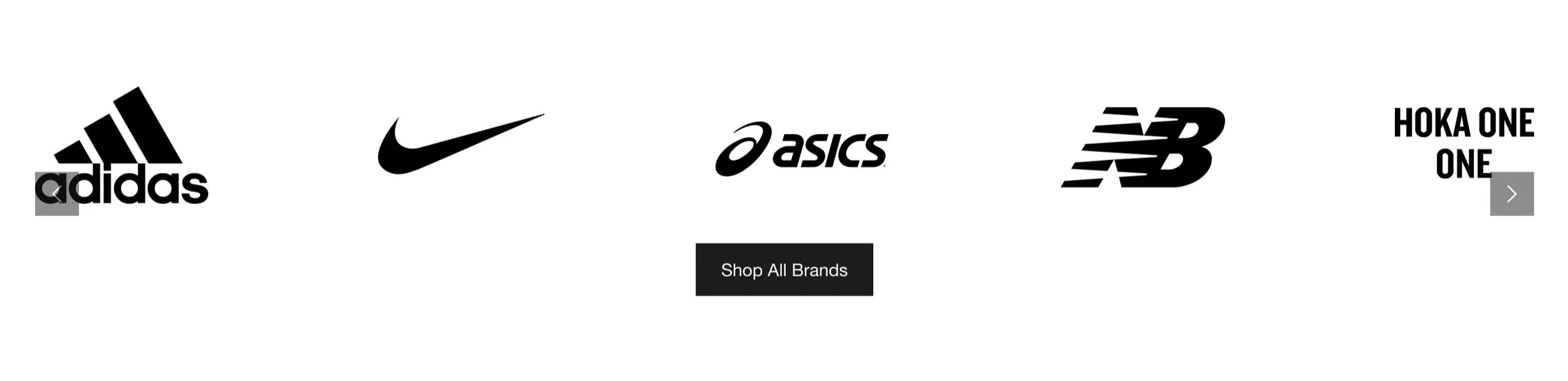
Brand Marquee quick links for increased discoverability
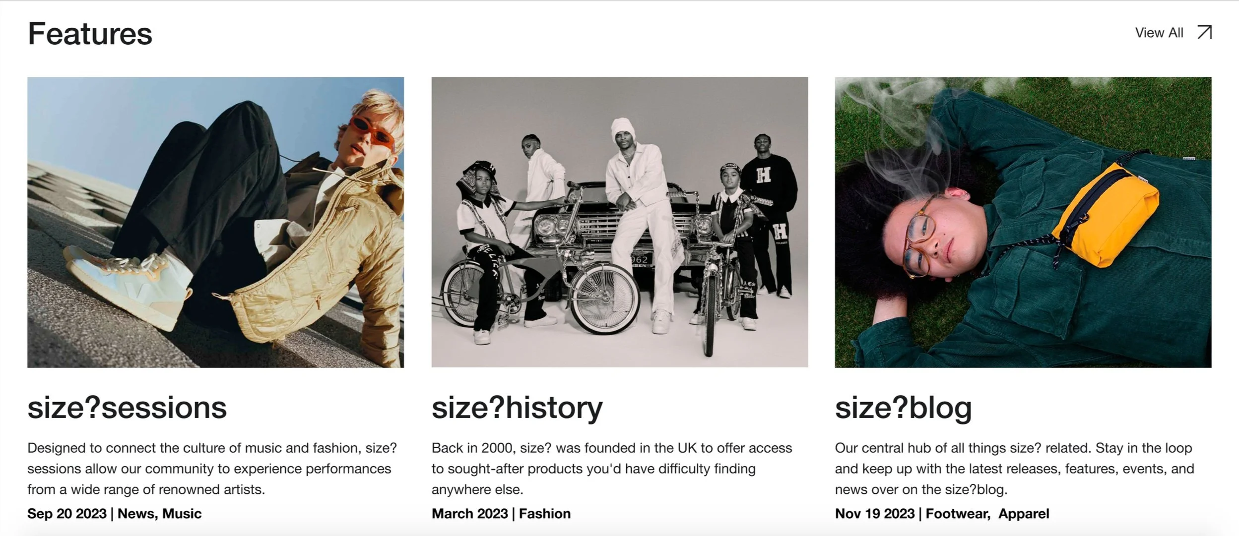
Features Editorial for more news and in-depth information about fashion, culture, and art
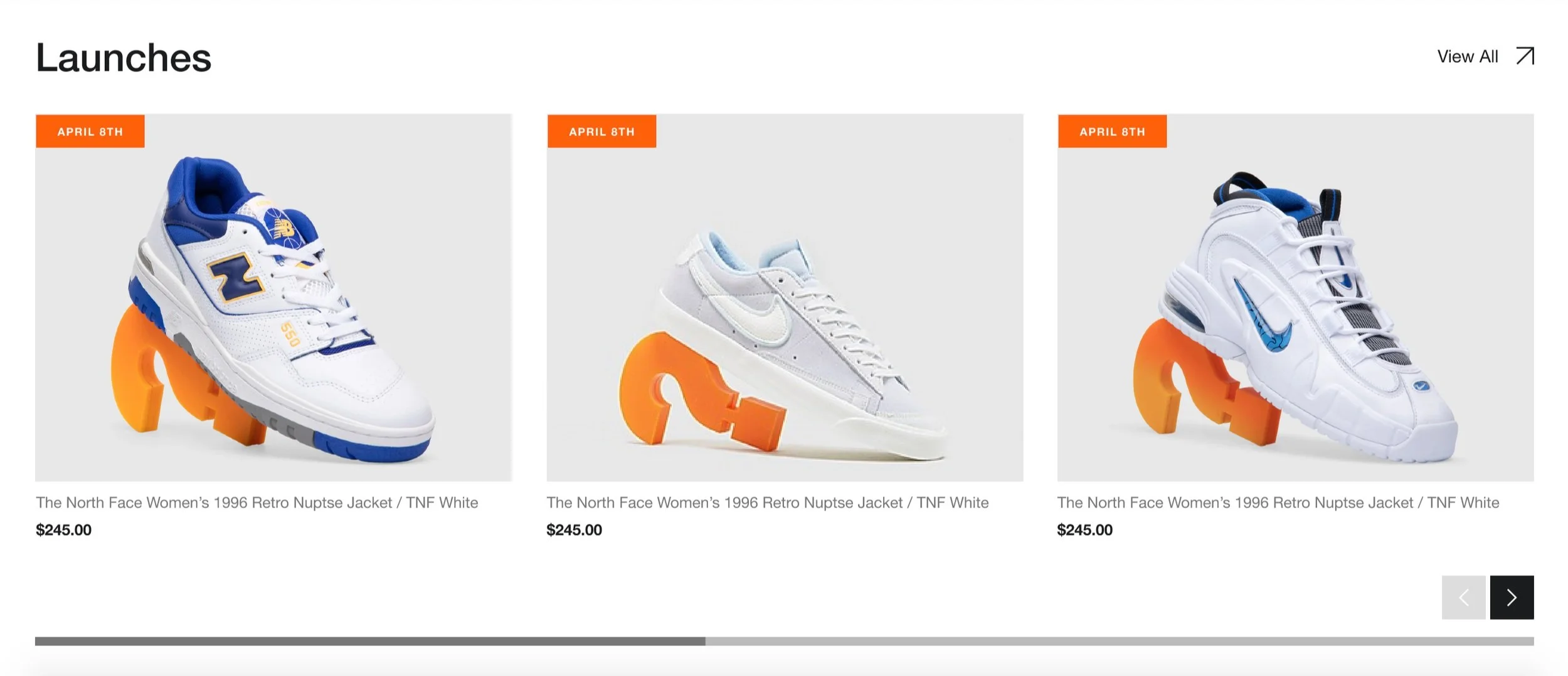
Upcoming Releases section
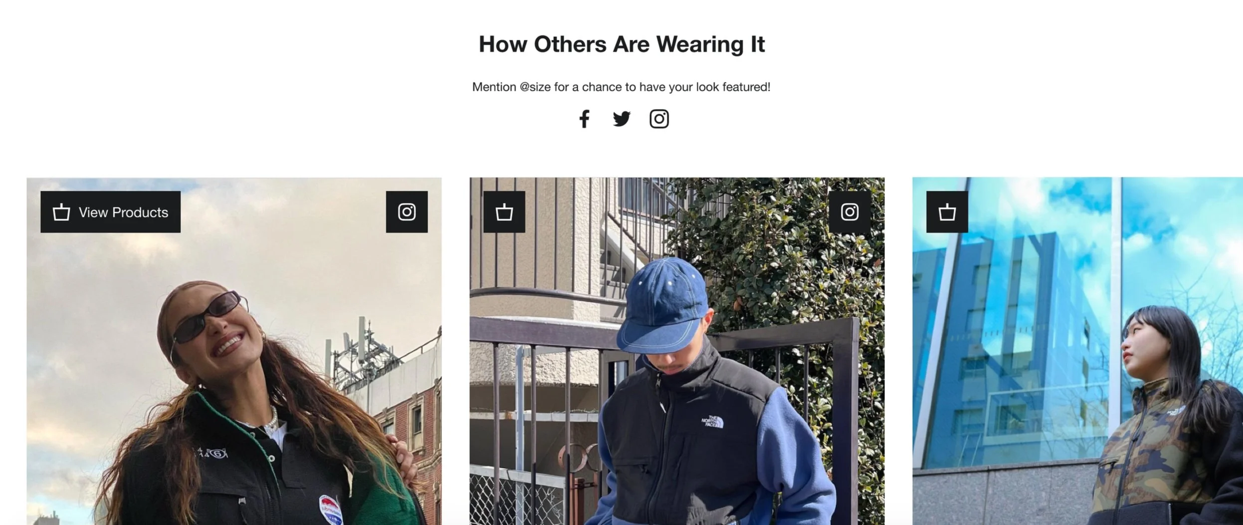
Social Media; increased social proof with the functionality of viewing products worn in images
Reflection
Redesigning the home page was a refreshing project to tackle. It was fulfilling to completely redesign the home page based on user testing results and see it ultimately in its completion. Despite this being the the refined version, there were functions that were too large in scope to be able to implement immediately:
Including the social media section required more time and effort to be able to sort and filter images and keep up to date in relation with product availability.